

If your lead generation forms are blocking conversions, it doesn’t matter how good your lead-generating strategies are.
That said, If you lose prospects at the last barrier because your forms are too overwhelming or difficult to complete, you’ve wasted almost all of your lead generation budget.
Focusing on sales is good but to achieve that goal you need to go through a few steps. And lead generation forms are a major step.
Your online forms will be crucial whether you’re seeking to collect lead information, sell subscriptions, or allow people to register for an event.
It can make the difference between getting a fresh sales lead and getting a bounce. Focus on form design to guarantee that your lead generation form is optimized for your users.
We’ll look at 11 WordPress form design best practices and examples in this article.
We’ll also talk about the best practices for lead generation forms so we don’t leave any stone unturned to get you good leads.
So without any further ado;
Let’s dive right in!
Table of Contents
- BrokerNotes
- Chamaileon
- WebScoot
- Expat.com
- Daily Harvest
- Uber
- Single Grain
- Moz’s Free SEO Analysis Tool
- BasePaws
- The Zebra
- Stitch Fix
- HubSpot(Bonus)
What are WordPress Lead Generation Forms?
I assume you already know what are WordPress forms but in case you are new to the space, here’s a quick definition;
The practice of generating customer interest in a product or service to convert that interest into a sale is known as lead generation.
A lead generation form is a web form used to collect potential customers’ emails and other information. Contact forms, registration forms, and simple newsletter signup forms are the most usual sorts of lead generation forms.

Best Practices
Before we see the 11 best lead generation form designs, let’s go through some best practices so we know what we’re up to.
learn about WooCommerce Registration form Plugins & why you need them.
#1. Greet your visitors
Welcome your visitors before presenting them with questions and explain the objective of the form explicitly to establish a good first impression and build a nice atmosphere.
#2. Learn KISS (Keep It Simple, Stupid) rule
The “keep it simple, stupid” (KISS) rule can be applied to a variety of sales and marketing situations, including web form design.
Only ask for the information you necessary and disregard the rest.
This method is fantastic for reducing user friction. Because visitors are less likely to feel overwhelmed, they are more likely to complete the form completion process, which may lead to better conversions.
#3. Add auto-format
including auto-format in your forms is a smart move. Your user will always have the information stored in their browser in this manner. The stored data will be automatically put into the form.
This method can be used on checkout forms as well.
Many people are ready to save their credit card information with Google since it is inconvenient to have to look at the card and type in the information every time they want to buy something or use a service.
#4. Offer Copy & Paste
Allowing people to copy and paste information into your forms is a terrific way to boost your conversion rate. To avoid misspellings and other issues, your visitors may want to copy and paste the information.
Nevertheless, the fact that it saves time is a brownie point.
#5. Be Mobile-friendly
In the first quarter of 2021, mobile devices were responsible for 54.8% of international website traffic.
it’s easy to see why you should design a website form with mobile consumers in mind. A user-friendly design will help you gain the trust of a large number of people.
It is critical to provide a positive experience to all users, regardless of the devices they use. Allow your users to switch to the next form field to make your form more user-friendly. Constantly clicking on the necessary line is inconvenient and time-consuming.
#6. Explain why you’re requesting specific information
If you’re asking your users for specific information, don’t forget to clarify why you’re asking.
It will boost your customers’ confidence and credibility. If you don’t clarify the purpose, they may reject to give required confidential information.
#7. Have a Sorted Privacy Policy
Transparency is one of the most appealing traits in a brand, according to 66 percent of buyers. Incorporating your privacy policy can help you win customers’ trust by increasing transparency.
However, while adding it to your forms, be inventive. Come up with a sentence that is related to your offer instead of “we never spam you.”
In addition, make use of FOMO and Analytics.
FOMO can persuade your visitors to take action right away rather than abandoning your website.
Analytics will help you keep track of what you’re doing.
There are far many ways to design lead generation forms, although only a few succeed in converting visitors into leads.
Let’s see a few best converting designs;
11 Best WordPress Lead Generation Forms
The most successful lead generation forms/campaigns, as you’ll see from the majority of the examples in this blog, tend to use multi-step forms, which allow you to collect data from users without resorting to long, overwhelming forms.
Although this blog is dedicated to WordPress users, those of you using other types of websites can benefit from this as well!
So let’s get started!
1. BrokerNotes

What to learn
Make sure your forms don’t look like forms.
The idea behind this form was to avoid making it look like a form. People dislike forms, and let’s be real; A form like this seems like a two-way conversation and is of utmost engagement.
Use clickable components to reduce cognitive load.
Every UI element required a physical activity (a mouse click or movement) rather than a cognitive action from a psychological standpoint (having to think and type). In short, don’t stress your leads.
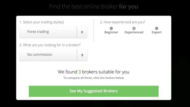
Make better questions using conditional logic.
Conditional logic is another strategy used to hide/show specific questions to specific users. You wouldn’t want to ask a newbie trader which trading platform they prefer because it’s doubtful they have one.
This is a crucial question to ask someone who responded that they were an expert.
By asking the most relevant questions to distinct audience segments, conditional logic allows you to capture more information about users while segmenting them better. It’s a win-win.
2. Chamaileon
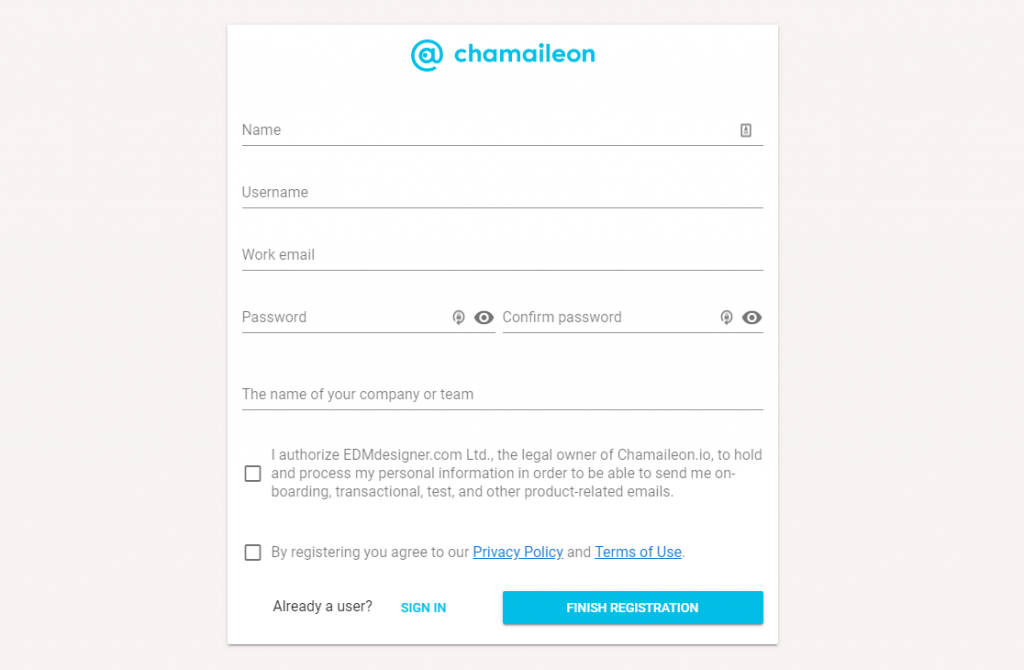
What to learn
Make a form that is straight to the point, with minimal frills and a clean, functional design.
A distraction-free landing page increases the chances of form submission. Sometimes rather than going over the board with designing, a simple elegant design like this would be all you need to need to acquire quality leads.
Use a brightly colored call to action button with an actionable copy.
Give a clear navigation call to your lead. Having a simple design doesn’t mean you have to leave out information.
Having such gaps confuses the lead and results in an unsubmitted and incomplete form which would’ve rather converted into a potential lead. Bright colored buttons assure leads what they have to do.
3. WebScoot.io
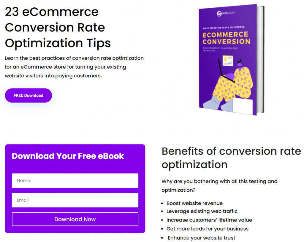
What to learn
Offer giveaways although display their value.
While we had a few designs in this list, WebScoot stands out. Why?
WebScoot offers visitors valuable stuff for free in return for signing up.
The users tend to sign up to avoid missing out on such valuable stuff which would’ve rather cost them.
Eventually filling a form becomes the least of the user’s worries as they perceive the reward much to be the bigger deciding factor.
This strategy, while being simple, is quite effective.
4. Expat.com
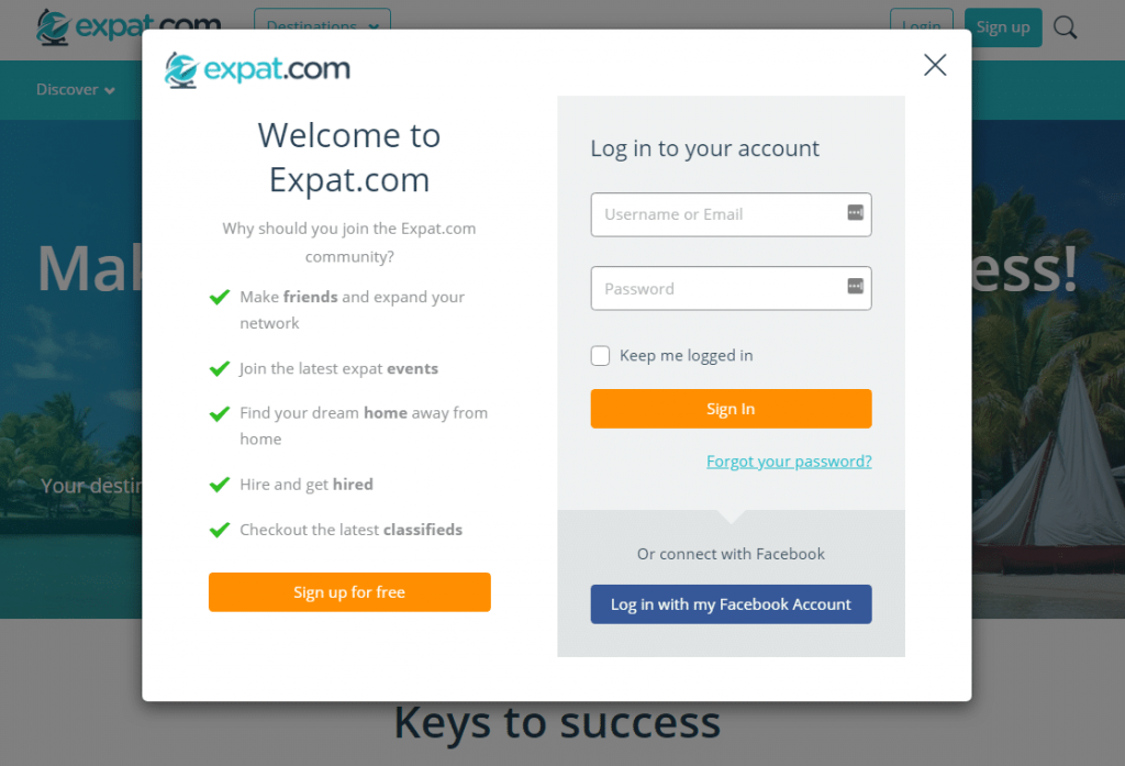
What to learn
List benefits in a split style form.
A list of bulleted benefits on a split-style form helps present visitors with the best reasons to convert without taking up too much room.
A list of benefits leads the eye to a call to action button. It’s also a smart move as some would say, the first impression is the best.
With benefits right along, you can make sure your first impression is right on the mark.
5. Daily Harvest
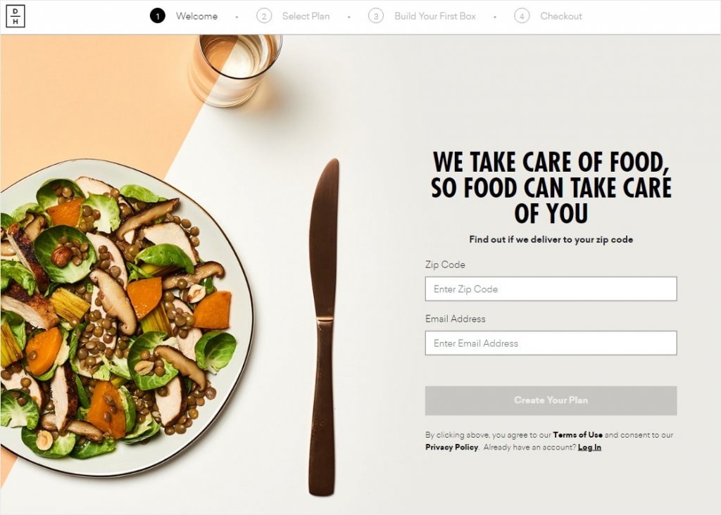
What to learn
Take quality space for your form.
What if your form takes up your whole page and has high-the quality images with simple navigation? Well, you get a high lead conversion rate.
Big fonts and bright color call-to-action buttons provide appropriate navigation to the user.
Using a distraction-free form that is well versed with high-resolution images gives a sense of quality to visitors which in turn results in lead generation.
6. Uber

What to learn
Curate since the beginning.
Uber faces the difficult task of separating two unique categories of leads: drivers and passengers.
With this task, the organization goes right to the point by asking customers what they want from its software – none of this “sign up first, we’ll ask the question afterward” stuff.
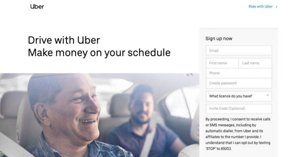
This method automatically separates Uber prospects and allows the company to send each type of prospect one of two forms.
Through this way, the users can directly cut to the chase and get what they come for.
The takeaway here is that brands that serve two sides of the same service need to segregate lead types from the start.
7. Single Grain
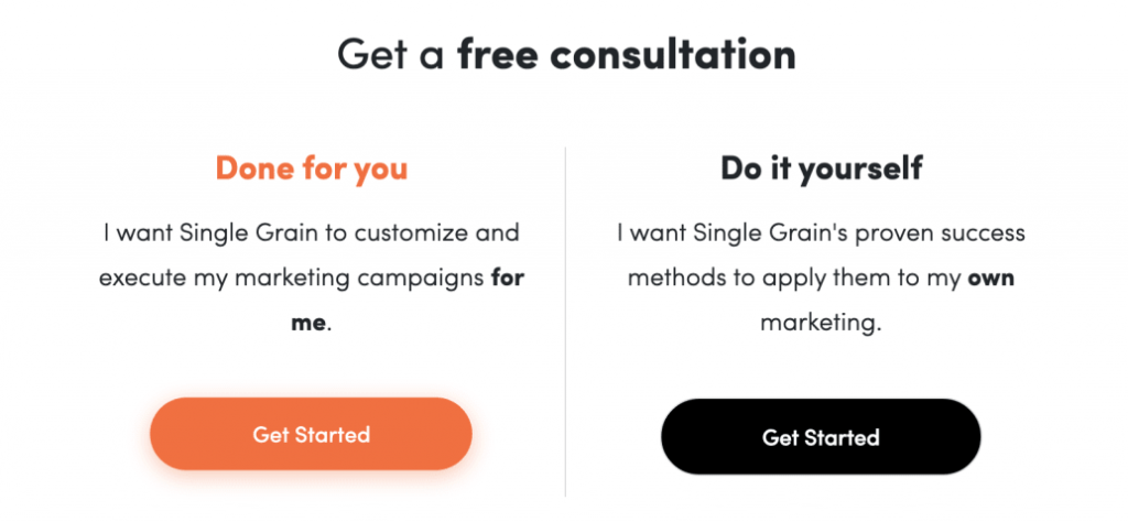
What to learn
Curate paid leads.
Single Grain uses a strategy to qualify two categories of leads: those interested to pay for the agency’s services and those seeking free information. Rings a bell?
But unlike Uber, Single Grain prioritizes leads who show an early willingness to pay to work with the agency.
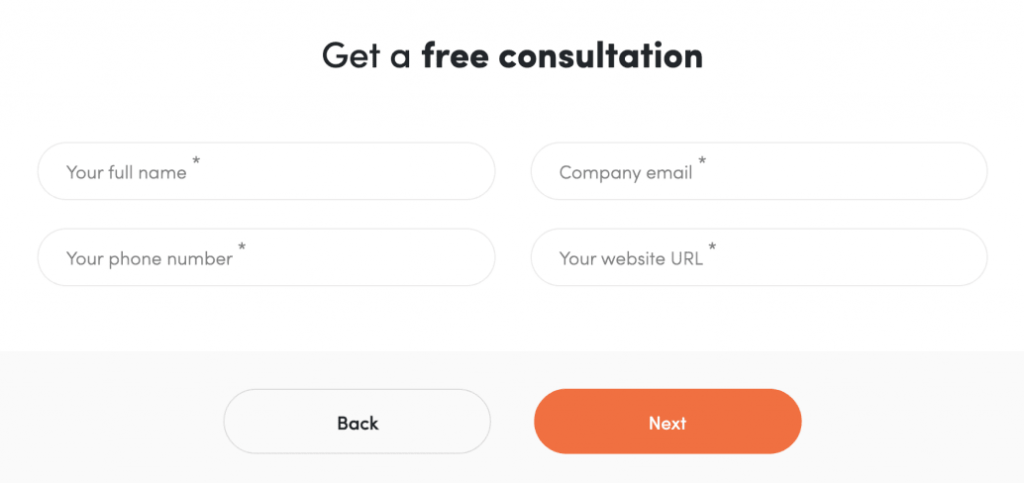
Users who merely want to engage with the company’s free content are asked to enter some basic information (company name, size, etc.) and are subsequently added to the appropriate email marketing list by Single Grain.
As a result, the company can focus its efforts on leads who express an interest in doing business with them, while the others are placed on appropriate lists to be nurtured with email and content marketing campaigns aimed at converting weaker leads into potential clients over time.
8. Moz’s Free SEO Analysis Tool
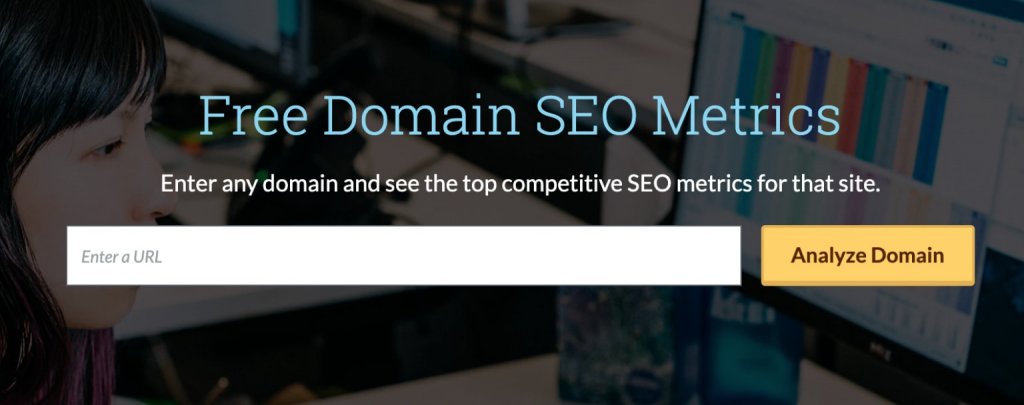
What to learn
Provide free limited service then upsell.
Many businesses utilize free products to generate leads, but Moz takes it to another level by using a free service to attract customers and then upselling them to the free edition of its software platform.

The goal is to convince customers to pay for Moz’s software platform, however, this two-step soft-sell strategy helps convert warm leads into potential customers.
9. Basepaws
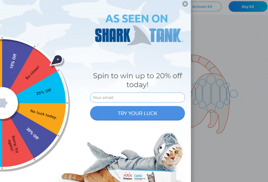
What to learn
Show your Achievements.
Basepaws made a point of mentioning their Shark Tank appearance right away on their lead-generating form, relying on social proof in addition to a few other conversion-boosting strategies.
Visitors take social recognition seriously, if your brand has been recognized by a valued entity and you display it to your visitors, the chances of their conversion increase.
Offer deals in a fun and engaging form.
Basepaws shows a Spin-to-win coupon wheel for a fun user experience, to claim the reward, the visitor has to enter their information, thus becoming a potential lead.
10. The Zebra
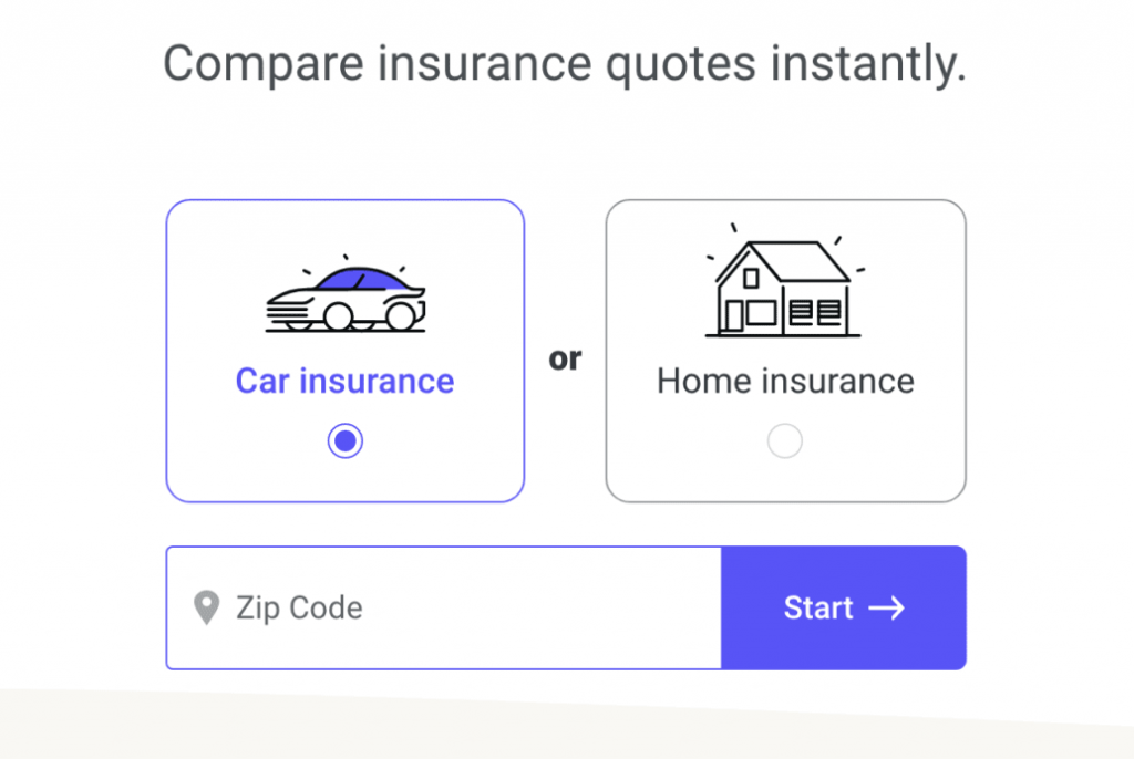
What to learn
Gamify the form.
Gamified forms are considered one of the best kinds of lead generation forms.
TheZebra’s lead capture form ‘gamifies’ itself once you’ve provided some basic information by boosting the accuracy of your insurance quote as you add more data.
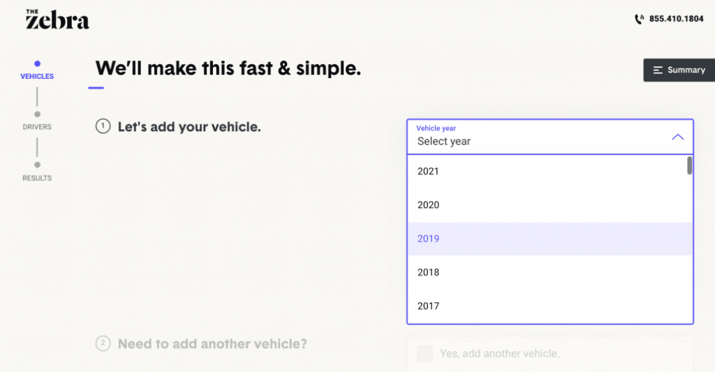
A percentage meter climbs in real-time as you answer more questions, motivating you to answer even more.
Insurance is a notoriously difficult business for lead capture forms, but TheZebra has built one of the best I’ve seen, taking into account a slew of factors that normally lead to increased engagement.
Thus even if you’re in a space like that, gamified forms will work like a charm.
11. Stitch Fix
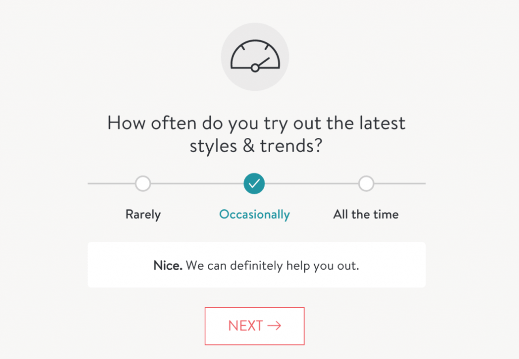
What to learn
Make hyper-personalized form.
Stitch Fix offers items to customers to try on based on their preferences and personalized fashion advice from industry experts.
This highly personalized service offers the company complete freedom to ask people for any information they needed, knowing that the more information they disclose, the better the service they will receive.
Stitch Fix has devised a hyper-personalized quiz-style sign-up procedure that learns more about each unique user to keep the process simple. As you can see, each time a user selects an option, the form provides feedback.
The sign-up process is lengthy, but the experience is enjoyable, and the constant sense that data entry will be rewarded motivates you to keep going.
12. HubSpot

What to learn
Disguise forms as free tools that provide value.
HubSpot’s website grader is a lead generation form disguised as a simple tool. It’s wonderful since it just requires two pieces of information before it starts delivering value.
You’re giving a tailored web audit of your site’s performance after entering your web address and email. If you click ‘Try HubSpot for Free,’ you’ll be prompted for more details; if you don’t, they’ll still contact you to try to sell you their software.
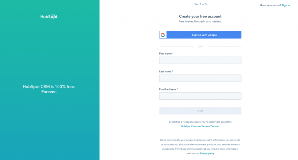
The lesson here is to recognize the power of a simple form and to provide value (such as an audit) in exchange for your visitors’ information.
Blog-end
Well, that was it! 11 best lead generation form designs I came across.
To succeed in lead generation yourself, follow the best practices I mentioned and take inspiration from the designs.
Always remember to provide value in some or another way.
Avoid making the mistake of overlooking the power of lead generation forms, although don’t get overwhelmed by it either.
Just intuitively design your form according to your brand and target audience and you’ll be good to go.
Here’s an idea, tell me which one was your favorite lead generation form design or if any other design that should’ve made it to this list in the comments!
Read Top 5 eCommerce Conversion Tips To Boost Traffic.

Foorqan is a Digital Marketing enthusiast who likes to play with current Digital Marketing techniques and try new Marketing tactics. When he’s not following his passions, He follows his hobbies which are reading, traveling, and writing.


0 Comments